The logo features a character that is also used as an identifier for the different content and action areas.
The color palette was inspired by elements of nature.


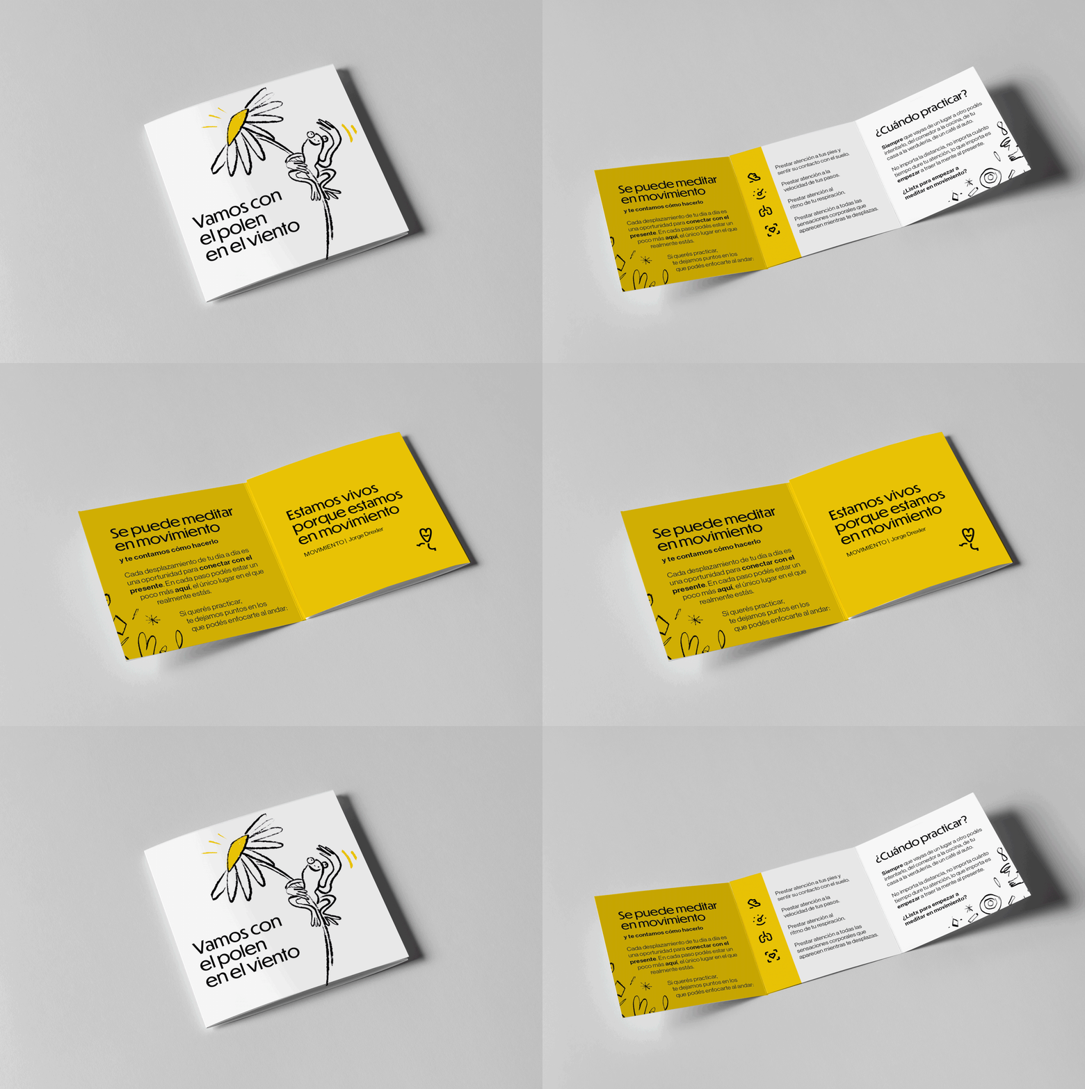
Branding for an organization that promotes and contributes to people's well-being through mindfulness. The foundation of the visual strategy was to build a language that conveyed simplicity and closeness to the audience; gender-neutral and friendly tone, while also being impactful and attractive. Digital and analog visual codes were combined. Vibrant and full colors alongside manual and imperfect strokes. The era of apps, artificial intelligence, and virtuality, along with the most human and real gestures.

